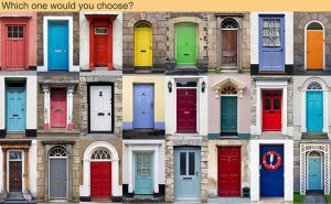
Colours are not simply important, they are vital, and play a tremendous parting capturing attention, influencing imagination and even evoking certain feelings. It can soothe our eyes or make us anxious, raise our blood pressure or suppress our appetite. When used in the right ways, color can even save on energy consumption. Psychological influence, communication, information, and effects on the psyche are aspects of our perceptual judgment processes. Hence, the goal of colour design in an architectural space are not relegated to decoration alone.
Colour Theory
- Colour theory is both the science and art of colour.
- It explains how humans perceive colour; how colours mix, match or clash, the subliminal messages colours communicate; and the methods used to replicate colour.
- It is important to know how colours interact with each other.
- If combined in certain ways they have different effects on each other and the environment around them.
History of colour theory

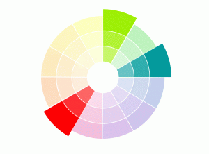
Note: A basic colour wheel, derived from the Newton's colour wheel, showing primary, secondary and tertiary colours is further used in the document.
Basics About Colour
PRIMARY COLOURS
Red, Yellow and Blue
- These are three pigment colours that cannot be mixed or formed by any combination of other colours.
- All other colors are derived from these hues.
SECONDARY COLOURS
Green, orange and purple
- These are the colours formed by mixing the two primary colours.
TERTIARY COLOURS
Yellow-orange, red-orange, red-purple, blue-purple, blue-green & yellow-green
- These are the colours formed by mixing primary and secondary colour.

Hue
A true colour or a shade of a colour.

Shade
A hue darkened with black.

Tone
A hue dulled with grey.

Tint
A hue lightened with white.

Colour Temperature
There are two types of colours on basis of the temperature they depict:
- Warm colours
- Cool colours
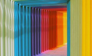
1. Warm colours
- These colours tend to advance in space and can be overpowering.
- These are generally associated with energy, brightness, and action.

2. Cool colours
- These colours are not overpowering and tend to recede in space, hence making the space look larger.
- These are generally identified with calm, peace, and serenity.

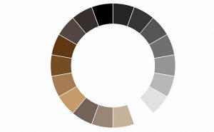
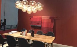
Neutral colours
- Neutral means without colour.
- It includes black, white, grey, beige, taupe, ivory and such colours.
Psychological effects of colours
Colour is a sensory perception, having effects that are symbolic, associative, synthetic, and emotional. It is one of the design goal consideration that demands adherence to ensure human psychological and physiological well-being within a space.The impression of a colour and the message it conveys is important in creating the psychological mood or ambiance that supports the function of a space.
Every colour has some significant psychological effect, both positive and negative. Colour associations are not necessarily universal. It depends on a range of factors like gender, age, ethnicity, culture, etc. some influences are same irrespective of all the factors. Some such effects of colours are discussed below:
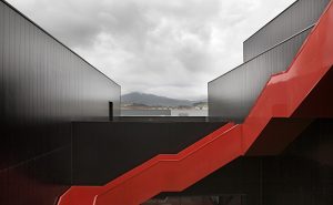
Red
- Red is the most dominant and dynamic colour.
- The eye actually has to adjust focus, since the natural focal point of red lies behind the retina. Consequently it appears closer than it is.
Association
- Positive: passionate, fervid, active, strong, warm
- Negative: intense, aggressive, raging, fierce, bloody
Effect
- Energetic and exciting
- Bold and passionate
- Fun
- Powerful
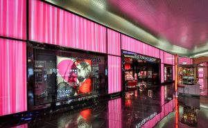
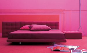
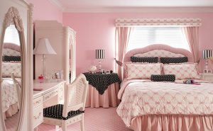
Pink
- It is essentially a light red and is usually associated with love and romance.
- It is generally considered feminine, but that depends much on the nuance used (varying from old rose pink to hot pink).
Association
- Positive: jovial, lively, energetic, extroverted
- Negative: intrusive, blustering
Effect
- Calming
- Feminine and vibrant
- Joyful, lively and creative
- Refreshing
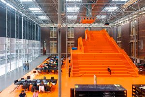
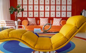
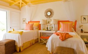
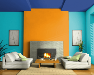
Orange
- It is usually used as an accent colour to draw attention.
- It is a bright and uplifting colour, hence it is mostly avoided in space that are subjected to relaxing.
Association
- Positive: cheerful, vigorous, energetic, extroverted
- Negative: agitative, blustering
Effect
- Excitement and enthusiasm
- Warmth
- Increased energy levels
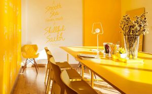
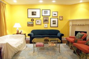
Yellow
- It is the happiest colour. It can also be used to draw attention like other warm colours.
- Bright yellows tend to inspire optimism and foster an upbeat attitude, hence it can be used where mood needs to be uplifted.
- Still, too much yellow can lead to anger, frustration or agitation.
Association
- Positive: sunny, cheerful, radiant, vital, artistic
- Negative: egocentric, glaring
Effect
- Cheering
- Energetic
- Creative
- Warmth
- Aggressive
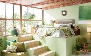
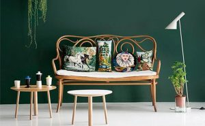
Green
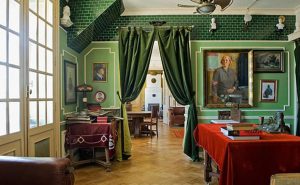
- When looking at green the eye focuses exactly on the retina, which makes green the most restful colour to the eye.
- Green is thought to relieve stress and it helps in healing.
Association
- Positive: tranquil, refreshing, quiet, natural, peace
- Negative: common, tiresome, guilty, sickly
Effect
- Calming
- Compassionate
- Optimistic
- Productivity
- Organic or natural
- Refreshing
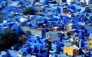
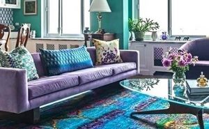
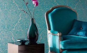
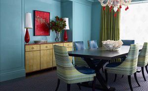
Blue
- It is a calming colour which is said to lower blood pressure and appetite.
- It can be used to create an atmosphere of work and meditation.
- The light shades of blue can be used to visually enlarge a room.
Association
- Positive: calm, sober, secure, comfortable, noble
- Negative: frightening, depressing, melancholy, cold
Effect
- Retiring
- Relaxing
- Stability
- Increased productivity
- Sincere
- Intense (dark shades)
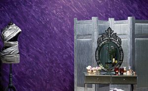
Purple
- Red shade (Purple) attract more attention and is more dominating.
- Blue shade (Violet) can be serene and calm and gives an air of mystery.
- Purple is an opulent colour which creates an atmosphere of luxury and class. It has a reputation of being a royal colour associated with power.
- The dark shades can be used to create a dramatic focal element, whereas the lighter shades are ideal for providing restfulness.
Association
- Positive: dignified, exclusive, royal
- Negative: lonely, mournful, pompous, conceited
Effect
- Exotic
- Regal
- Sensual
- Soothing
- Mysterious
Brown
- It usually induces a feeling of naturalness and comfort, as it symbolizes earth.
- It can add depth and warmth in a space. Unpolished wood or wool textiles in natural shades of brown create a pleasant rustic effect.
- In feng shui, brown represents either wood if it is dark and rick or earth if it is light.
Association
- Positive: warm, secure, stable
- Negative: lonely, sad, oppressive, heavy
Effect
- Subduing
- Secure and stable
- Reliability
- Resilience
- Natural
- Sophisticated
- Warmth
Grey
- It gives the feeling of subtle elegance because it is not too conservative, but still quite formal.
- It combines very well with other colors, but if used alone it might create a boring atmosphere.
Association
- Positive: Neutral
- Negative: Boring
Effect
- Elegance
- Clean
- Fresh
- Sophisticated
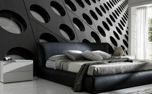
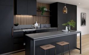
Black
- It is associated with oppressive power and darkness.
- Black is good for bold, dramatic effects since the color stands out and attracts the eye.
- It has certain negative connotations and has a weighty, serious aspect, but can also create a mood of refinement and elegance.
Association
- Positive: deep, abstract
- Negative: dungeon-like, night, grief, death
Effect
- Elegance
- Clean
- Bold
- Formal
White
- White is used to create an airy appearance, quiet and pure.
- It is often used to make rooms seem larger and more spacious and give an invigorating freshness.
- It represents purity or innocence.
Association
- Positive: clean, crisp, bright, fresh
- Negative: empty, sterile, stark, cold, isolated
Effect
- Clean
- Refreshing
- Sterile
- Empty
- Bright
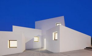
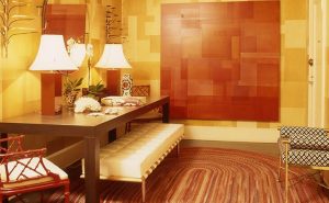
Casa MM, a residence in Mallorca designed by OHLAB, has white facade which not only makes it look clean and bright but also keep the place cool.
Colour Harmony
Harmony engages the viewer and it creates an inner sense of order, a balance in the visual experience. To achieve this, the following colour schemes work as basic formulas.
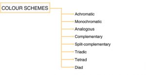
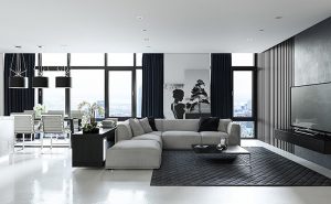
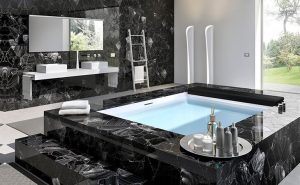
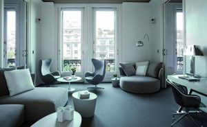
Achromatic Scheme
This scheme possesses no hue. It uses only black, white and grey

IMPACT ON SPACE
- It makes the space look clean, simple and classy.
- It is usually used in bathrooms, kitchen and living room.
ARTICULATION
1. Adding an accent colour
- An accent colour can be added to give a particular focal point in the area.
- It is usually done with throw pillows, art and other accessories.
2. Impression of the surface
- Different patterns and textures, like marble, can be used to provide an interesting tactile sense to the space.
3. Perception of depth
- Using relief features in this scheme provides the variance in depth which this scheme otherwise lacks.
4. Combination with wooden surface
- Wooden surface can be used for furniture or flooring with this scheme to provide a classy and rich look.
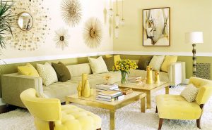
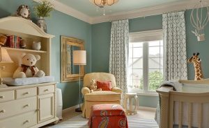
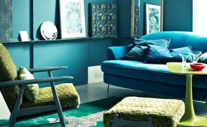
Monochromatic Scheme
This scheme possess various shades, tones, or tints of a single hue.
IMPACT ON SPACE
- This type of scheme is more subtle and conservative.
- It creates a harmonious and visually cohesive look.
- Since this scheme lacks definition or focal area, they tend to be calm and soothing.
- It sets the scene for a minimal style.
- Monochromatic scheme creates relationship and progression in a space. Some features might appear to be a louder or more prominent.
ARTICULATION
1. Association of colour
- The effect in a space is stimulated by choosing the base colour that depicts the required characteristic of space. For example, pink colour is often used for interiors of girls.
2. Breaking the monotony with textures and patterns
- Different pattern and textures can be added to the scheme to add a tactile sense to the design.
3. Adding an accent colour
- An accent colour can be added to highlight some parts of the space and simply add extra visual interest.
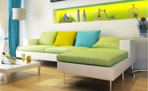
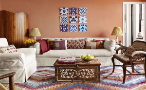
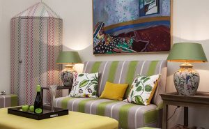
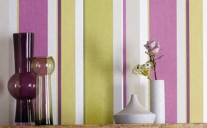
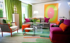
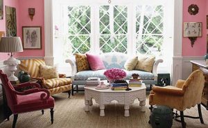
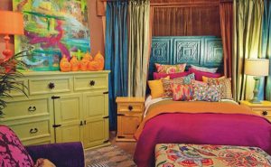
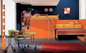
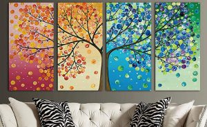
Analogous Scheme
This scheme consists of hues that are side by side on the colour wheel. This type of scheme is versatile and easy to apply to design.
IMPACT ON SPACE
- The colours in this scheme blends well and create a comfortable, serene & harmonic look.
ARTICULATION
1. Balancing the colours
- The colours should be chosen such that one color dominates, one supports and another accents.
- Usually primary colour is taken as the dominant colour, the lightest as a support and the mid-tone colour is used as accent colour.
2. Using a certain section of space
- Analogous colours don't have to cover an entire space for the beneficial aesthetic to have effect.
- They can be simply put to one component of the room, like art or other accessories and create harmony.
3. Introducing a complementary colour
- This strategy brings out the best in every colour while still maintaining balance and colour harmony.
4. Harmonize with patterns and textures
- Maintaining a similar tone or tint within the analogous colour scheme is important when various patterns or textures are being used, to achieve a consistent feel & coherent design scheme.
5. Semblance to analogous scheme
- The colours are deeper than similar analogous colour groupings.
- They relate to the original colours of an analogous scheme but are not the same. This can be seen where there is a material variation.
6. Metallic analogous
- Metallic materials can be treated as the key component or as a support to the main colour in the scheme.
7. Adding in a neutral colour
- With this scheme, neutral colours can be added to bring stability in the colorful scene and provide a balance. It makes the space less busy.
8. Breaking the rule
- Use of decidedly analogous pattern with other patterns that only have a trace or relation with one or two of the analogous colors can be an interesting combination.
- It all works together because of the colour relationships.
9. Playing with the lighting
- Light gradations and depth of design can be used to create a stunning analogous effect.
10. Adding accent colour
- Using large, chunky doses of analogous colours and then breaking up the space with smaller, neutral pieces and details helps to create a focal interest.
11. Portrayal of the scheme on furniture or accessories
- A large statement piece, such as a living room sectional can be picked to represent the colour scheme.
- If the furniture itself can't turn analogous, consider incorporating large pillows in solid analogous colors for a similar effect.
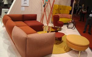
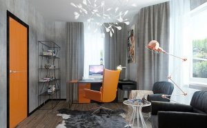
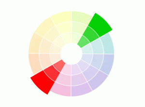
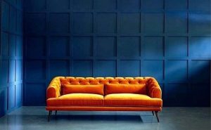
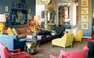
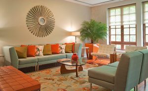
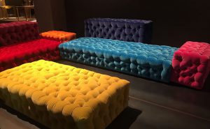
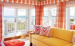
Complementary Scheme
This scheme uses complementary colours, i.e. two colours which are directly opposite each other and relative tints of those colours.
IMPACT ON SPACE
- These colours bring extra vibrance to a space and make it pop.
- They are useful if small spaces, like home office or a powder room, need to pop.
ARTICULATION
1. Balancing the colours
- If too much vibrance in the space is not required, the colours should be chosen such that one colour dominates and other works as an accent colour.
2. Embrace neutrals in the scheme
- Introducing a neutral colour in this scheme will provide a place for the eyes to rest and keep from being overwhelmed.
3. Dimming the saturation and brightness
- To avoid creating a chaotic, overwhelming space, choose muted shades like pale lavender and creamy light yellow.
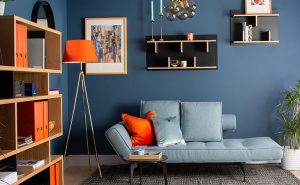
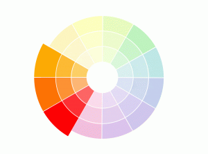
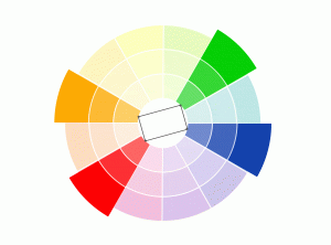
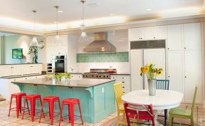
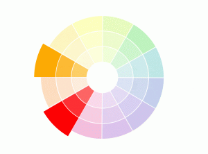
Split - Complementary Scheme
In addition to the base colour, two colours adjacent to its complement are used.
IMPACT ON SPACE
- This scheme has the same strong visual contrast as the complementary colour scheme, but has less tension.
- Unlike the complementary scheme, this is more comfortable for the eyes.
- It is softer and has more space for balancing warm and cold colours.
ARTICULATION
1. Balancing the colours
- The base colour is the main colour. The secondary colours should be chosen for highlights and accents.
- Since there are two secondary colours, base colour is never too loud or dominating.
2. Including monochromes
- Various monochromatic shades and tints of the base colour can be added to make the scene more interesting.
3. Blending with patterns and textures
- To create a casual yet luxurious look, patters and textures can be added in the scheme.
4. Muting the colours with white
- To create an even more soft and calm environment, the scheme can be used with white colour.
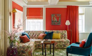
Triadic scheme
It uses colours that are evenly spaced around the colour wheel.When these colours are linked by a straight line, they form a triangle.
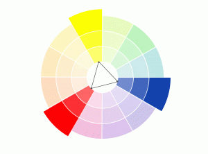
IMPACT ON SPACE
- This scheme tend to be quite vibrant, even if pale or unsaturated versions of hues are taken.
ARTICULATION
1. Balancing the colours
- Since the colours are equally spaced, visual balance is required to avoid too much popping of space.
- One colour should govern the design and others can act as accents.
2. Using tints of each hue
- To avoid too much vibrance and brightness, tints of each hue of the scheme can be used.
- This will soften the visual effect of the space.
3. Adding neutrals
- Neutral colours like white, grey, tan and black can be used with the scheme to temper the vibrance.
4. Composing the space
- Two colours can be used for the space while the third can be used as the background.
- This is a sophisticated way to implement the scheme and deepen their aesthetic.
5. Material mimicking colour
- It is not necessary to get the exact same colours from the colour wheel.
- Different materials can be used to portray different colours in the space.

6. Varying saturation
- To make the space more energetic and vibrant, more saturated hues can be made use of.
Tetrad Scheme
The rectangle or tetrad colour scheme uses four colors that are arranged into two complementary pairs.
IMPACT ON SPACE
- This scheme tend to be quite vibrant, even if pale or unsaturated versions of hues are taken.
- It requires a sensitive approach as it is an aggressive and very rich looking scheme.
ARTICULATION
1. Balancing the colours
- Since both the pairs are complimentary, a harmonious balance has to be achieved.
- This can be done by making one colour or pair of colours dominant than other.
2. Subduing the scheme with neutral colours
- The popping and contrast in the space can be minimized by adding neutral colours (mainly white).
3. Focusing on artwork or furniture
- The vibrant effect can also be diminished by concentrating the scheme only to the artwork or furniture and keeping the rest of the space plain.
Diadic Scheme
A diadic or diad colour scheme uses two colours that are separated by one colour on the colour wheel.
IMPACT ON SPACE
- This scheme creates visual harmony as it contains just enough of the target colour to make the leap onto the other colour.
ARTICULATION
1. Adding neutral colour
- Neutral colour can be added to break the monotony of the scheme and temper its effect.
2. Variation in material, pattern or texture
- Using different material and patterns in the scheme can make it more interesting.